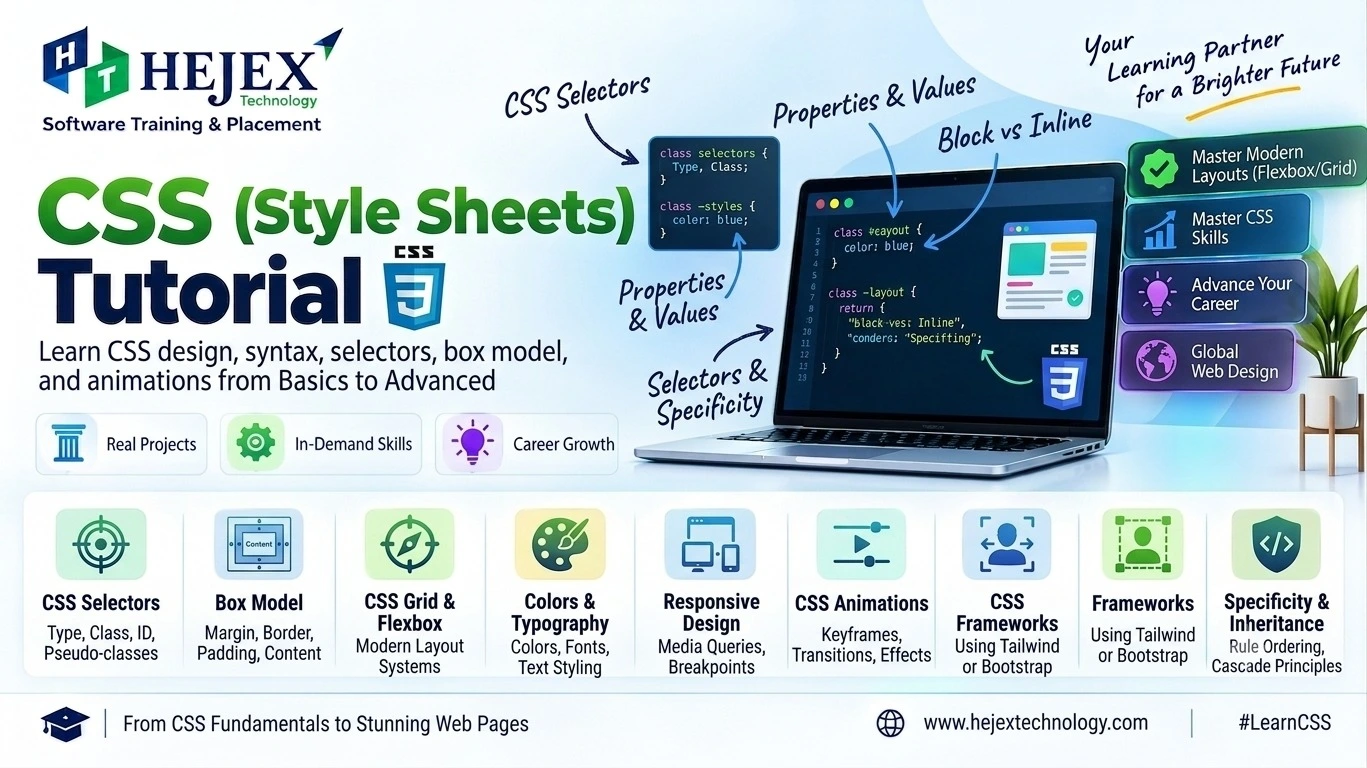
What is CSS?
CSS (Cascading Style Sheets) is a stylesheet language used to describe how HTML documents are presented. It controls color, typography, spacing, sizing, borders, backgrounds, alignment and layout.
HTML provides structure and meaning; CSS controls presentation. Keeping these responsibilities separate makes interfaces easier to maintain, reuse and adapt across screen sizes.
<style> element, or in an external .css stylesheet. External CSS is
usually the best choice for reusable site-wide styling.
Simple CSS Example
h1 {
    color: #173b8f;
    font-size: 2rem;
}
This rule selects <h1> elements and applies two declarations: color
and font-size.
Is CSS a Programming Language?
No. CSS is a stylesheet language, not a programming language. It is used to control the presentation, layout and visual appearance of HTML elements. CSS does not provide general-purpose programming logic such as functions, loops or conditional statements. Instead, it defines how elements should be displayed, positioned and styled in a web page.
Practical learning note:
A strong understanding of HTML fundamentals and JavaScript fundamentals makes modern front-end development easier to learn. HTML provides the structure and meaning of a web page, CSS controls its presentation and layout, and JavaScript adds interactivity and dynamic behavior.
Learners who want to build responsive and interactive user interfaces can continue with Front End Developer Course in Chennai after developing a strong foundation in HTML and CSS.
CSS3 and Modern CSS
“CSS3” is a common learning term, but modern CSS is not one single version. CSS evolves through separate modules and specifications. Modern CSS includes features such as Grid, custom properties, nesting and container queries. Learn the fundamentals first, then adopt newer features when they solve a real design or layout problem.
CSS Syntax and Ways to Add CSS
A CSS rule contains a selector and a declaration block. Each declaration contains a property and a value.
selector {
    property: value;
}
p {
color: #333;
line-height: 1.6;
}Three Ways to Add CSS
Inline
<p style="color: #173b8f;">
    Hello CSS
</p>
Useful for a very specific one-off style, but difficult to maintain at scale.
Internal
<style>
.title {
    color: #173b8f;
}
</style>
Useful when styles belong to a single document.
External
<link rel="stylesheet"
href="style.css">
Preferred for reusable styles across multiple pages.
CSS Selectors, Cascade and Specificity
Selectors determine which elements a rule targets. Common selectors include element, class, ID, attribute, descendant, child, sibling, pseudo-class and pseudo-element selectors.
p { color: #333; }                         /* element */
.card { padding: 1rem; }                   /* class */
#header { background: #111; }              /* ID */
input[type="email"] { border: 1px solid #999; } /* attribute */
nav a { text-decoration: none; }           /* descendant */
nav > ul { list-style: none; }             /* child */
button:hover { transform: translateY(-2px); }  /* pseudo-class */
.card::before { content: ""; }             /* pseudo-element */
For component styling, reusable classes are generally easier to maintain than IDs or deeply nested selectors.
Understanding the Cascade
The cascade decides which declaration wins when several rules can apply. In modern CSS, the browser considers relevance, origin and importance, cascade layers, specificity, scoping proximity and source order.
Specificity is a weighting system used when competing declarations are otherwise in the same cascade context. IDs carry more specificity than classes, attributes and pseudo-classes; those carry more than type selectors and pseudo-elements.
Inheritance allows certain properties, such as color and
font-family, to pass from ancestors to descendants. Not every CSS property inherits.
!important as
a routine fix. First check selector specificity, cascade layers, source order and whether the
selector
can be simplified.CSS Properties, Values, Text, Fonts and Backgrounds
A property describes what you want to change; a value specifies how it should be changed.
.box {
    width: 20rem;
    padding: 1rem;
    background-color: #f3f6fb;
}
CSS values can be lengths, percentages, colors, numbers, keywords or functions such as
calc(), min(), max() and clamp().
Useful Units
px– CSS pixel unit.%– relative to an applicable containing dimension.rem– relative to the root element's font size.em– relative to the relevant font size or context.vwandvh– relative to viewport dimensions.
Typography
body {
    font-family: Arial, sans-serif;
}

p {
    font-size: 1rem;
    line-height: 1.6;
    color: #333;
}

h1 {
    font-size: clamp(2rem, 5vw, 3.5rem);
    font-weight: 700;
}
Use readable font sizes and sufficient line height. clamp() is useful when typography
should scale within a controlled minimum and maximum.
Backgrounds and Borders
.hero {
    background-color: #eef3ff;
    background-image: url("hero.jpg");
    background-size: cover;
    background-position: center;
    border-radius: 0.75rem;
}
Do not use a background image for essential information. Meaningful images should normally be
represented with an HTML <img> and appropriate alternative text.
CSS Box Model
The CSS box model describes an element as four areas: content, padding,
border and margin. With the default box-sizing: content-box, declared
width
and height apply to the content box, while padding and border are added to the rendered size.
* {
    box-sizing: border-box;
}

.box {
    width: 300px;
    padding: 20px;
    border: 2px solid #173b8f;
    margin: 24px;
}
With border-box, the declared width and height include content, padding and border.
Margin remains outside the border.
Content
The actual text, image or other content.
Padding
Space between content and border.
Border & Margin
Border surrounds the padding; margin creates outer space.
CSS Layout: Display, Position and Overflow
CSS layout controls how elements participate in the document and how space is distributed. The most important tools are display, positioning, Flexbox and Grid.
Display
.container {
    display: flex;
}

.hidden {
    display: none;
}
Common values include block, inline, inline-block,
flex, grid and none.
Position
.card {
    position: relative;
}

.badge {
    position: absolute;
    top: 0.5rem;
    right: 0.5rem;
}
Position values include static, relative, absolute,
fixed and sticky. Absolute positioning is useful for overlays and special
placement; it should not replace Flexbox or Grid for normal page structure.
Overflow
.panel {
    max-height: 240px;
    overflow: auto;
}
Use overflow deliberately because clipping content can create usability and accessibility problems.
Flexbox
Flexbox is a one-dimensional layout system designed to align and distribute items along a row or column.
.nav {
    display: flex;
    justify-content: space-between;
    align-items: center;
    gap: 1rem;
}
Important container properties include flex-direction, flex-wrap,
justify-content, align-items, align-content and
gap. Item properties include flex, flex-grow,
flex-shrink, flex-basis and align-self.
Use Flexbox for navigation bars, toolbars, form rows, card alignment and other layouts where the main design relationship is one-dimensional.
CSS Grid
CSS Grid is a two-dimensional layout system for arranging content across rows and columns.
.grid {
    display: grid;
    grid-template-columns: repeat(3, minmax(0, 1fr));
    gap: 1rem;
}
Responsive Grid
.grid {
    display: grid;
    grid-template-columns: repeat(
    auto-fit,
    minmax(220px, 1fr)
    );
    gap: 1rem;
}
Grid is especially useful for page sections, dashboards, card collections and interfaces where both rows and columns matter.
Responsive Web Design
Responsive design means a layout adapts to available space and content instead of assuming one fixed screen size. Good responsive CSS combines flexible layouts, relative sizing, appropriate images, readable typography and conditional rules.
Viewport Setup
<meta name="viewport"
        content="width=device-width, initial-scale=1.0">
Flexible Container
.container {
    width: min(92%, 1100px);
    margin-inline: auto;
}
Media Query
@media (max-width: 768px) {
    .nav {
    flex-direction: column;
    align-items: stretch;
    }
}
Do not design only for named devices. Start with the content and add breakpoints where the layout actually needs to change.
Modern CSS: Custom Properties, Nesting and Container Queries
Modern CSS provides features that make styles more reusable and component-friendly.
Custom Properties
:root {
    --brand: #173b8f;
    --surface: #f5f7fb;
}

.button {
    background: var(--brand);
    color: white;
}
Custom properties participate in the cascade and can be reused through var().
CSS Nesting
.card {
    padding: 1rem;

    &:hover {
    transform: translateY(-2px);
    }
}
Native CSS nesting lets related rules be grouped together in modern browsers. It is different from a preprocessor because the browser parses the CSS nesting directly.
Container Queries
.card-wrapper {
    container-type: inline-size;
}

@container (min-width: 500px) {
    .card {
    display: grid;
    grid-template-columns: 1fr 1fr;
    }
}
Container queries allow a component to respond to the size of its containing element rather than the viewport, which is useful for reusable UI components.
CSS Transitions, Transforms and Animations
Transitions
.button {
    transition: transform 0.2s ease,
                background-color 0.2s ease;
}

.button:hover {
    transform: translateY(-2px);
    background-color: #0d2d73;
}
Transitions smooth changes between states such as :hover, :focus and
:active.
Transforms
The transform property can translate, rotate, scale or skew an element without changing
normal document flow.
Keyframe Animations
@keyframes fadeIn {
    from { opacity: 0; }
    to { opacity: 1; }
}

.message {
    animation: fadeIn 0.4s ease-out;
}
Respect Reduced Motion
@media (prefers-reduced-motion: reduce) {
    *,
    *::before,
    *::after {
    animation-duration: 0.01ms !important;
    animation-iteration-count: 1 !important;
    scroll-behavior: auto !important;
    transition-duration: 0.01ms !important;
    }
}
Use motion to communicate state or improve feedback, not simply to decorate every element.
Common CSS Mistakes and Best Practices
Too Much Inline CSS
Mixing many style declarations into HTML makes reuse and maintenance harder. Prefer reusable classes and external stylesheets.
Unnecessary !important
Repeated use creates cascade conflicts. First inspect specificity, layers and source order.
Ignoring the Box Model
Remember that padding and borders affect rendered dimensions. A consistent
box-sizing: border-box strategy simplifies sizing.
Fixed Widths Everywhere
Rigid widths can cause overflow. Prefer flexible sizing and constraints such as
max-width where appropriate.
Overly Specific Selectors
Deep selectors become fragile. Prefer simple component classes and a deliberate cascade.
Ignoring Accessibility
Check contrast, readable text, keyboard focus, visible states and reduced-motion preferences.
CSS Learning Roadmap
- Learn syntax, selectors, properties, values and units.
- Learn colors, typography, backgrounds, borders and spacing.
- Master the box model, display and overflow.
- Learn positioning, Flexbox and CSS Grid.
- Build responsive layouts with flexible sizing and media queries.
- Learn transitions, transforms and keyframe animations.
- Learn custom properties, native nesting and container queries.
- Practice real interfaces and debug with browser DevTools.
- Move to JavaScript, Git/GitHub and a frontend framework or CSS framework.
CSS vs Tailwind CSS
CSS is the stylesheet language itself. Tailwind CSS is a utility-first framework that provides predefined utility classes built around CSS concepts.
| CSS | Tailwind CSS |
|---|---|
| Uses selectors and declarations | Uses utility classes |
| Direct control over CSS | Composes predefined utilities |
| Requires understanding the cascade and CSS layout | Still benefits from strong CSS fundamentals |
.button {
    padding: 0.625rem 1.25rem;
    background: #173b8f;
    color: white;
    border-radius: 0.5rem;
}
<button class="px-5 py-2.5 bg-blue-800 text-white rounded-lg">
Click Me
</button>Learn CSS before relying on a utility framework. Understanding the box model, cascade, layout and responsive CSS makes framework-based styling easier to understand and debug.
What to Learn After CSS?
After learning CSS fundamentals, the next step is to learn JavaScript to add programming logic, event handling, DOM manipulation and dynamic behaviour to web pages. A strong understanding of HTML and CSS provides the foundation for building structured, responsive and user-friendly interfaces.
After building a strong foundation in HTML, CSS and JavaScript, you can strengthen your frontend development skills by exploring the Front End Developer Course in Chennai . You can also learn frontend tools and technologies such as Bootstrap, Tailwind CSS and ReactJS to build modern, responsive and component-based user interfaces.
Those progressing toward complete web application development can explore the Full Stack Developer Course in Chennai to learn frontend development, backend programming, databases, APIs and full-stack application development.
Frequently Asked Questions About CSS
What is CSS?
CSS is a stylesheet language used to control the presentation, layout and visual appearance of HTML documents.
Is CSS a programming language?
No. CSS is a stylesheet language. It describes presentation rather than implementing general-purpose program logic.
What is the CSS box model?
It describes an element's content, padding, border and margin, which together define its box and surrounding space.
What is the difference between Flexbox and Grid?
Flexbox is primarily one-dimensional, arranging items along a row or column. Grid is two-dimensional and can control rows and columns together.
What are media queries?
Media queries apply CSS conditionally based on features such as viewport size, orientation or user preferences. They are widely used for responsive design.
What is CSS specificity?
Specificity is part of the cascade algorithm used to decide between competing declarations that match the same element. It works together with origin, importance, layers, scoping and source order.
Should I learn CSS before Tailwind CSS?
Yes. CSS fundamentals make utility classes, responsive styles and customization much easier to understand.
Can CSS create animations?
Yes. CSS provides transitions, transforms and keyframe animations for many interface effects.
What should I learn after CSS?
Learn JavaScript, then Git/GitHub and a frontend framework or development stack based on your goals.